What To Do With Your Churn Prediction Data in NSAW
So, you’ve turned on the Churn Prediction feature in NetSuite Analytics Warehouse , it’s processed overnight, and now you have a brand-new subject area called netsuite-churn prediction .
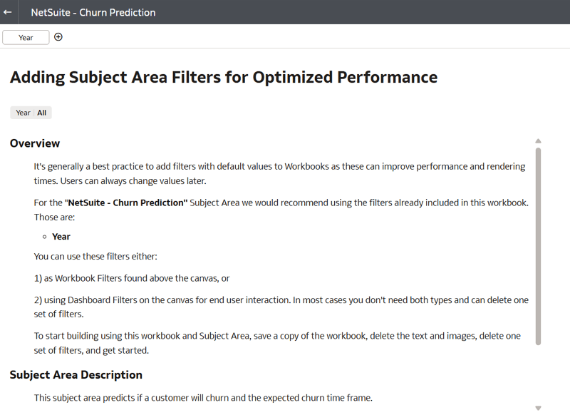
You’ll also notice in your catalog that there’s a corresponding dashboard called netsuite-churn prediction . However, when you open this dashboard, it doesn’t have any visuals in it. The dashboard is essentially a blank canvas connected to the churn prediction model, along with a short description of what you can do with the data and a default year filter.
So, this may leave you wondering: “What do I do with this now?”
The subject area description mentions several great use cases for how to leverage this data, but I want to take it a step further and turn it into something actionable for the sales team. My goal is to create a dashboard that highlights our most at-risk customers and shows their total spend amount , so we can get this data in front of sales and hopefully prevent those customers from churning in the first place.
Let’s break this down step by step.
Step 1: Start With the Churn Prediction Subject Area
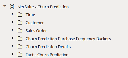
In your netsuite-churn prediction subject area, you’ll see several folders.
Let’s create a simple table on the canvas to start visualizing this data. Drag the following fields onto the Rows :
- From the Customer folder: Customer Company Name
- From the Fact - Churn Prediction folder: Churn Risk Score and Spend Amount
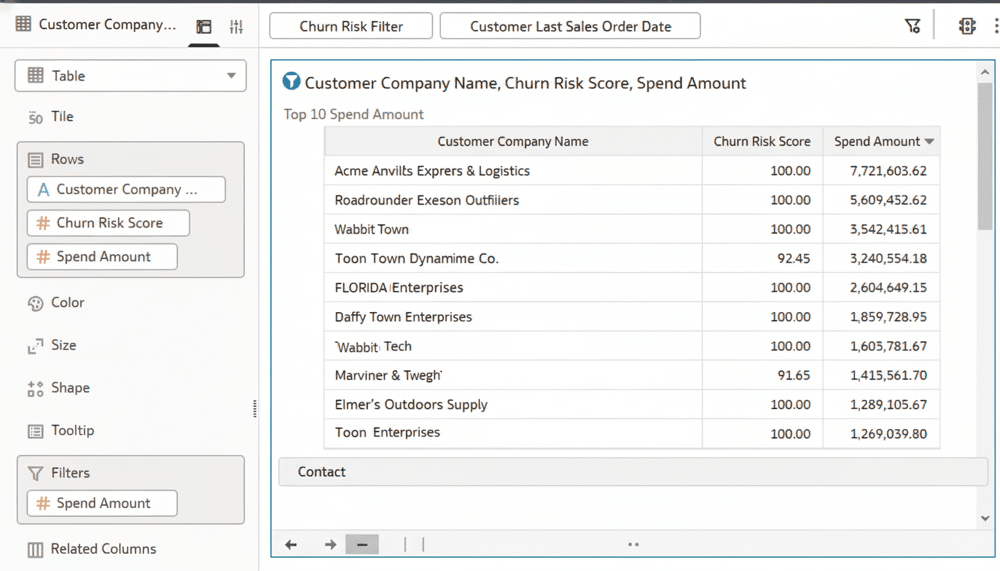
Once you drop these fields onto the canvas, you’ll have a table showing all of your customers, their churn risk score, and their spend amount.
Step 2: Focus on High-Risk Customers
I’m most interested in customers that have a high risk of lapsing, so let’s filter down to just those customers. To do this, we’ll filter for customers with a Churn Risk Score of 90 or above .
The easiest way to create this filter is to first turn the churn risk score into an attribute. You can do that by using this simple formula:
Attribute("Churn Risk Score" by "Customer Internal Identifier")
This creates a calculated field we can call
Churn Risk Filter
. Now, drag that calculation onto your dashboard filter and set
the range to start at
90
. This will narrow your table to show only customers with
a 90% or higher chance of churn.
Step 3: Filter for Recent Activity
When I looked at this data for the first time, I noticed it included a lot of customers who had already churned. To make the data more actionable, I also want to focus only on customers who have made recent purchases.
To do this, find Customer Last Sales Order Date under the Customer folder and drop it onto the dashboard as a filter.
I set mine to a rolling 12-month window, but use whatever timeframe makes sense for your business. This way, you’re focusing on customers who are both active and at risk.
Step 4: Filter Down to the Top 10 Customers
Now let’s narrow this down even further to the
top 10 at-risk customers by spend
— giving the sales
team a clear list to prioritize.
To do this, drag Spend Amount from the Fact - Churn Prediction folder onto the filters.
- Change the filter method from Range to Top/Bottom N
- Set the method to Top
- Set the count to 10
After applying this filter, you now have a table of your top 10 highest-spending customers that are also at high risk of churning.
Step 5: Add Context With Sales Trends
This table is very helpful, but let’s add some additional context for these at-risk customers. Specifically, I want to see their most recent sales trend by month to spot declining activity.
It’s worth noting that there’s a Sales Order folder within the churn prediction subject area, which is great for quick references. However, it doesn’t include the Base Currency Amount , which we’ll need for trend analysis.
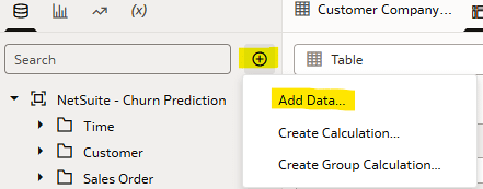
Fortunately, we can add another subject area to this workbook. Click the + in the top left corner of your Data tab and choose Add Data . Then, select the netsuite-sales order subject area to bring that data in.
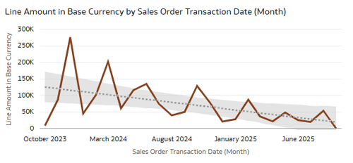
Step 6: Create a Line Chart for Monthly Trends
Now let’s create a simple line chart.
- From the Sales Order subject area, under Transaction Lines - Base Currency Amounts , add Line Amount (Base Currency) to the Values.
- Under Sales Order Details > Transaction Attributes , add Transaction Date (by Month) to the X-axis.
This gives you a monthly trend line showing the customer’s sales
volume in base currency. In the top left corner of your top 10
customer chart, click the small filter icon so that it turns
blue. This
activates it as a
canvas filter
.
Now, when you click on one of the customers in your top table, the line chart below will automatically update to show that customer’s sales trend.
In my example, our number-one at-risk customer has been steadily declining in sales over the past two years — exactly the kind of insight that should prompt the sales team to reach out and re-engage.
Wrapping Up
There are a lot of great ways to leverage the churn prediction data, but this simple dashboard setup is a strong place to start.
With just a few steps, you’ve turned the predictive model’s output into an actionable view that highlights your top at-risk customers, helps you understand their recent trends, and gives your sales team a focused list to follow up on.